My iOS App Creation Process — Part 3
In Part 1 of the series, I outlined my overall approach to iOS development. Here’s the outline of the significant steps as a reminder:
- Develop user personas and associated user stories
- Detail the Desired App Features and Requirements
- Determine Best App Architecture
- Determine the minimal viable product (MVP) for the initial app release
- UX design (SwiftUI)
- Data Modeling (JSON)
- Coding and Testing
- Preparing for iOS App Store Submission
- Develop plans for a future version to implement features that didn’t make the initial MVP for release
In my next couple of articles, I will focus on the fifth bullet by offering insights into how I approach interface design when building an app. For this particular article, I will focus on the process of designing the interface.
User Experience (UX) Design
I chose SwiftUI as the “language” for my UX design. My goal was to use no iOS storyboards in my app to determine if I could render my intended user interface using only Apple’s declarative design approach.
Before SwiftUI, my app development philosophy had always been: “Don’t start a line of code until you finish your iOS storyboards.” This philosophy served me well because it forced me to thoroughly think through how I envision a user navigating through my app. Now, with SwiftUI, I had to refine my philosophy, but only slightly: “Don’t start any non-SwiftUI code until you finish the SwiftUI code.” More importantly, the basic idea behind my philosophy remains completely unchanged: “Design your user interface before you start coding your app’s logic and models.” This approach has served me well not only in iOS app development but also in large scale system implementations. UX is essential and should not be an afterthought. The best code is useless if a user can’t use the app due to poor UX design!
“Design your user interface before you start coding your app’s logic and models.”
So, how does one start?
The Value in Basic Wireframing
When I was younger and in school, I was not too fond of the idea of generating an outline before writing a paper for a class. I would generally write the essay and then create the outline even if the outline was due weeks before the paper was due. My view of the outline was that it boxed me and potentially stifled my creativity. I didn’t understand the value of an outline until I began writing code. An outline doesn’t constrain my imagination; it frees me to explore various structures without the need to tear down and rebuild the content with each structure change! The time invested in defining the structure via an outline will save you 10x the time trying to restructure the finished paper. I know Mrs. Armstrong, my high school English teacher, would be very proud to hear me make that statement.
The act of wireframing an app interface is analogous to building an outline. It frees you to think through the various approaches you could take toward the interface without requiring you to rebuild your iOS storyboard or SwiftUI code every time you change your direction. Once you’ve settled on a workable approach, you can code the user interface.
As you can see from my screenshots below, I don’t invest much time trying to make my wireframes pretty. I generally use simple shapes and text available in almost any graphic app on either laptops or mobile devices. For me, the wireframing process is more critical than the wireframing presentation.
The wireframing process is more critical than the wireframing presentation.
For my app, I went back to my MVP, which defined at least three (3) views for the user:
- Photo grid screen
- Photo details screen
- Settings screen
Photo Grid Screen
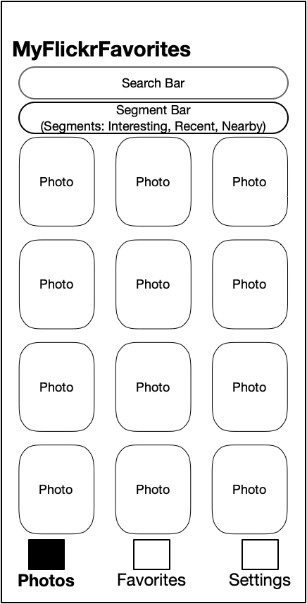
Based on the requirements, I developed a wireframe for the Photo grid screen that I named the Main screen since photos are the app’s primary elements.

Search Bar
The Search Bar represents the functionality that allows the user to search photo tags/keywords. The search scope is constrained to the photo stream context (e.g., interestingness, recent, or nearby).
Segment Bar
I chose a Segment Bar as the user’s method to switch between the various photo streams available in the app. The segment bar seemed very appropriate since the photo grid itself remains the same, with only the grid changing context.
Navigation
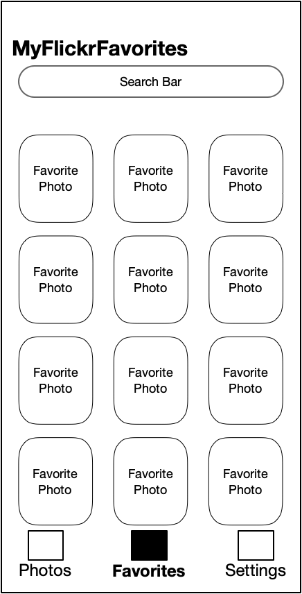
I realized the photo grid was the same between the main screen and the favorites screen during the wireframe process. Therefore, I chose to add a Navigation Tab to allow the user to easily switch between the main photos view and the favorite photos view. From that conclusion, it was quite natural to add another tab for the Settings screen the user would need to access.
Favorites Tab
The Favorites Tab is simply a photo grid of the Flickr user’s Favorites. There is no need for a Segment Bar for Favorites. Searching should still be an option within a user’s Favorites, so the Search field remains visible.

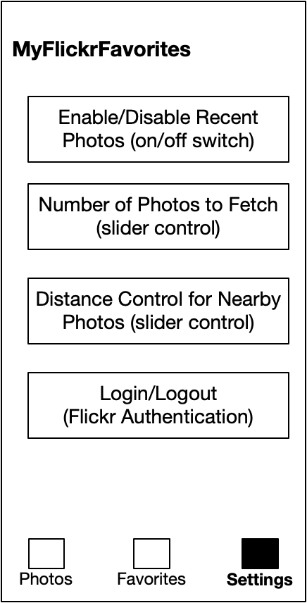
Settings Tab
The Settings Tab is simply another tab of the Main Screen. It contains different types of controls (e.g., on/off switch, sliders, other) based on the specific setting to be modified.

Photo Details Screen
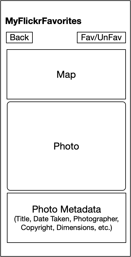
Based on the requirements when viewing a particular photo, there are three sections for the Photo Details Screen:
- Photo
- Map location where the photographer took the image (if geolocation data are available)
- A subset of photo metadata from Flickr

Buttons
The Back button moves the user back to a photo grid screen, either the Photos screen or the Favorites screen, whichever was the originating screen. The Fav/UnFav button allows the user to add/remove the specific photo to/from their Flickr Favorites.
Photo Section
First and foremost, the user should see the photo. The photo should be presented in its original aspect ratio where possible and scaled to fit the container so the user can see the entire image. Tapping on the picture should expand the photo to fill the screen instead of its container. Tapping the photo again should reset the photo size to be constrained to its container.
Map Section
If the photo has geolocation data available, the Map Section displays the location. The map should zoom to the specific area centered in the map container. The map view can be panned and zoomed so the user can attain further context of the photo’s location.
Photo Metadata Section
There are many potential metadata elements for a Flickr photo. The specific metadata elements displayed in this section will be a small subset of the available features. I chose to include those metadata mentioned in my wireframe as a starting point.
What’s Next?
Stay tuned for the next article when I explore how I implemented the wireframe views in SwiftUI.
Until next time, stay safe and keep learning!
